Continuing our “We don’t want it to look like PowerPoint” series, we again explore the idea that PowerPoint is not to blame, and that a better understanding of layout and design paired with knowledge of the tools you use, can create a fun, interesting, and educational experience.
Our last post showed us how a full screen background image can be used to immerse the viewer in the environment and experience. You will also want to make sure the size of your course, or the stage area, is large enough. By default, Storyline and Captivate have smaller sized stages. You will want to select a size based on the devices you plan to display your course on, and your design. Here is a helpful site for selecting the best screen size: http://www.articulate.com/support/storyline-2/how-to-determine-the-optimal-slide-size-for-mobile-devices-sl2
Many course designs feel caught in a box...
 ...which is likely not the intention. Here is an example of a learning module caught in a box:
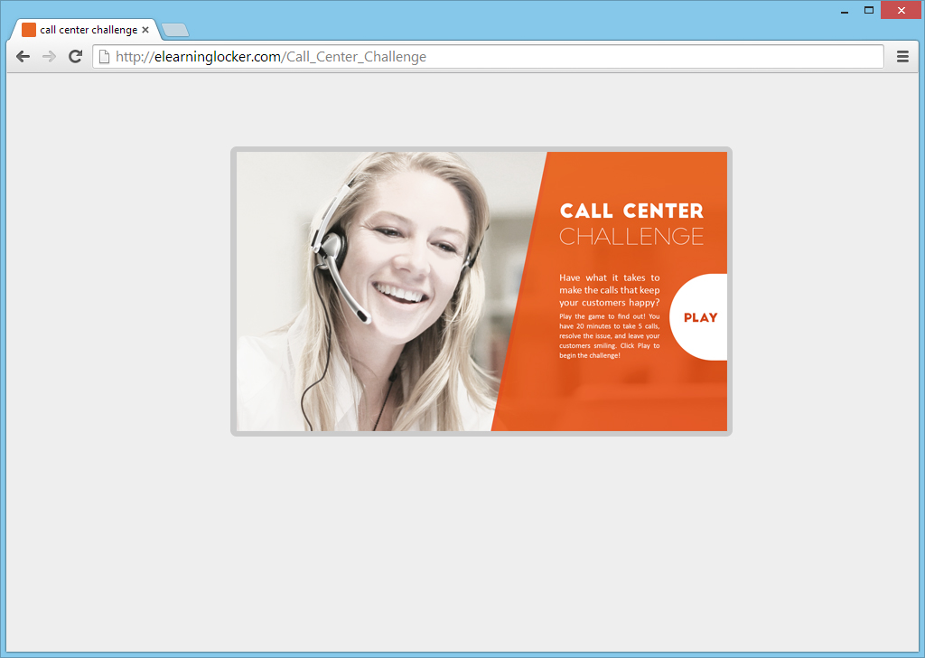
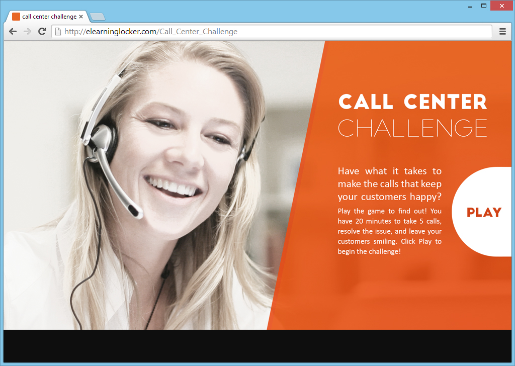
It isn't bad, but certainly feels like it isn't using the space effectively. The space around it is obviously noticeable as well. When you look at the course, your eye dances in and out of the box and the elements. This is not immersive. To bring the learner more into the design and the environment, lets scale it up and fill the screen. As you can see below, your eye might jump around but it jumps around within the course. You feel more immersed in a single environment and it is easier to focus on the message and the button.
Designing to fill the screen is one thing. Actually filling the screen is another. I feel that it is easier to fill the screen as discussed with custom built courses, but let's take a look though at Articulate Storyline, a common development tool, and see what options it has.
As you know, with Storyline, the default scaling when you publish and view your course in the browser, is quite small. Well not really small. It is the size you built your course at, but relative to the browser window on a larger resolution screen, it feels like you might want to use a magnifying glass. No fear, full screen is here! Well, kind of full screen.
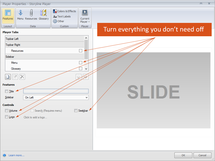 In Storyline, click Home in the ribbon. Then click the Player button. You will see all your player settings. First, maximize the space by turning off anything that isn't needed. This might be the title (as you might display it already in your design), the left menu, and even the seekbar (if, again, it isn't part of your design). If you were to publish now, you will see that your design looks a lot cleaner and more focused on your content.
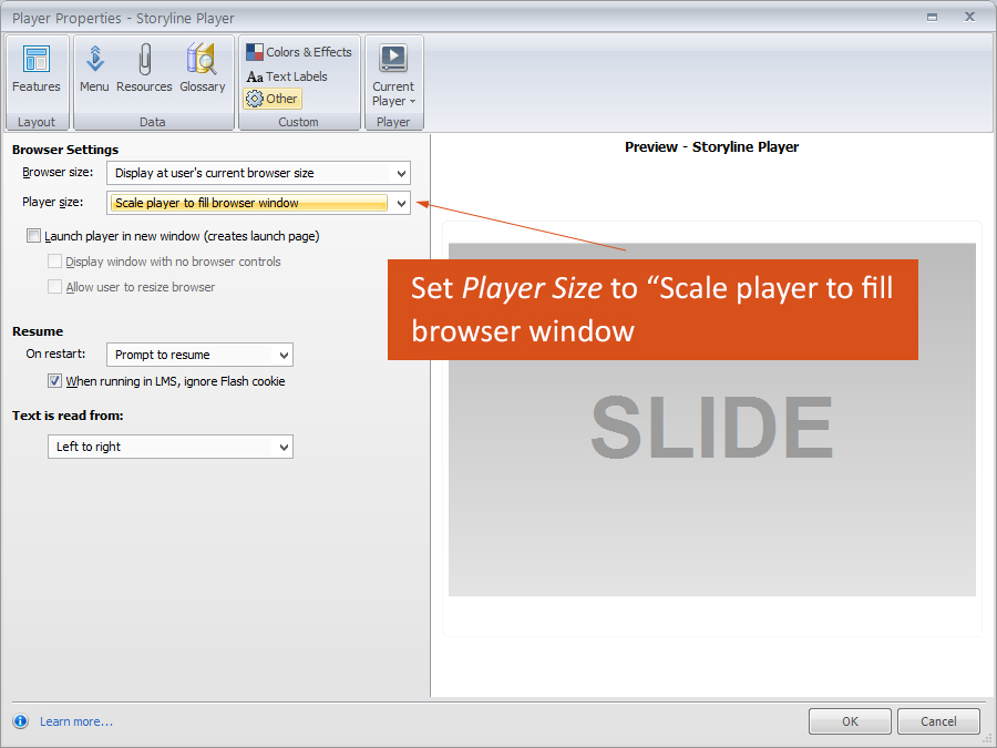 Next, from this same menu, click Other. Another screen with settings will open. In the Player Size drop down box, select "Scale player to fill browser window".
So what do you see now when you publish? You should see that your course is much bigger on screen. You will also notice it isn't completely full screen, where the design fills the width and height, or scrolls if the height is longer than your window. It scales the stage to fit within the browser size you are using.
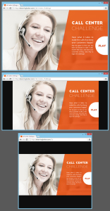 If your browser has a shorter height, you will have bars on the sides, and if your browser has a thinner width, you will have bars on the top and bottom. Not quite full screen, but for the most part, this will work pretty well. We recommend setting a background color that complements your design, and if you are using an LMS that launches your course in a window, make sure the window size is set the same as your course. If you really do need a full screen design, you may have to build it in another tool or use some SWF/Actionscript hacks which won't carry through to your HTML5 output. Presenter, Captivate, and Lectora all have similar results.
We will take a look at this same process in Captivate and possibly Lectora soon.
There are a lot of great sites out there covering full screen eLearning methods and designs. Check them out: https://www.google.com/webhp?sourceid=chrome-instant&ion=1&espv=2&ie=UTF-8#q=elearning%20full%20screen

